Expanded Design #6
Expanded #6
Comparison: Designs #5 and #6 share a look set mostly by the low single slope roof use and theme. Their plans and the their expanded plans don't really share anything. Design #6 spreads itself out similarly to most plans and therefore is more mix and match compatible with those designs.
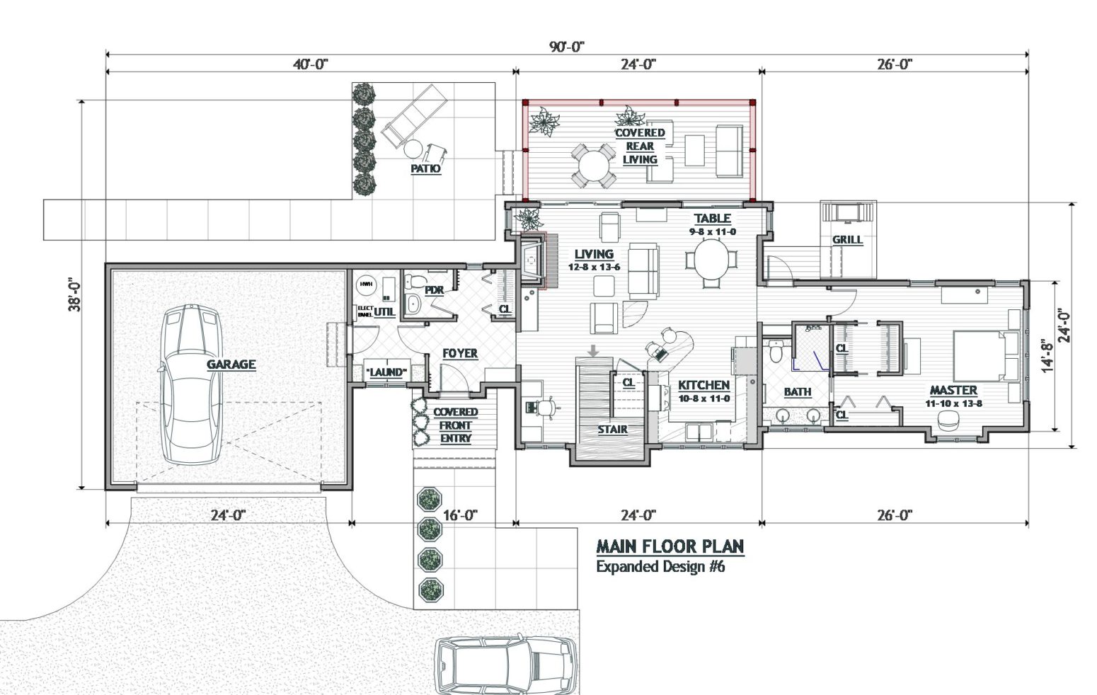
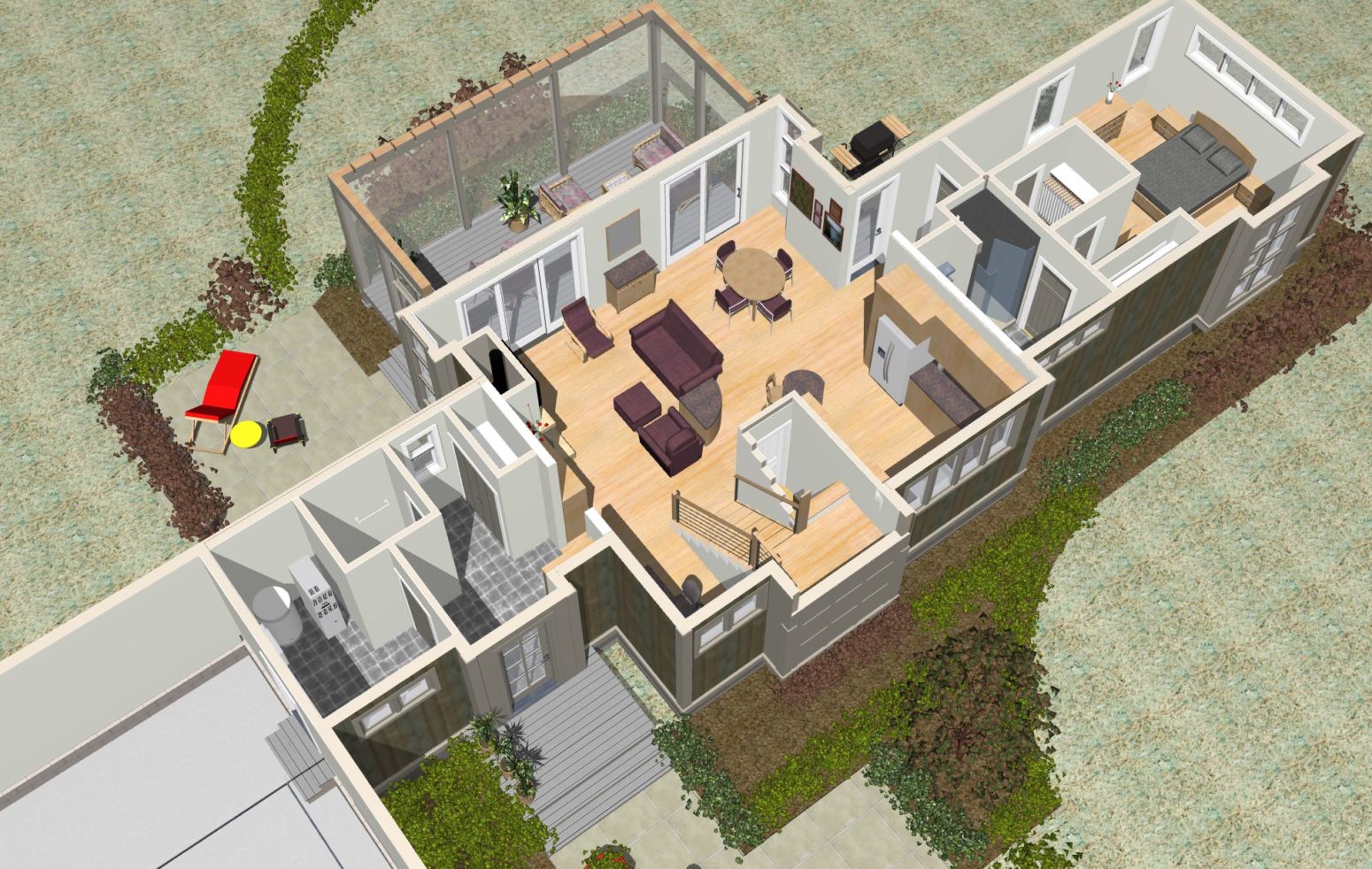
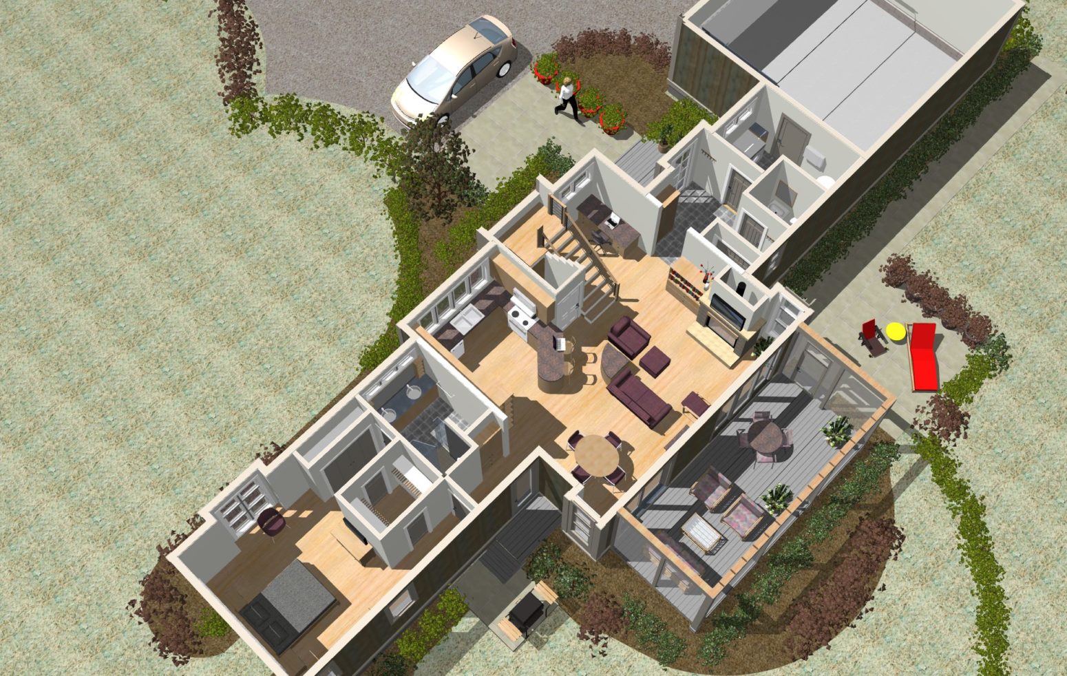
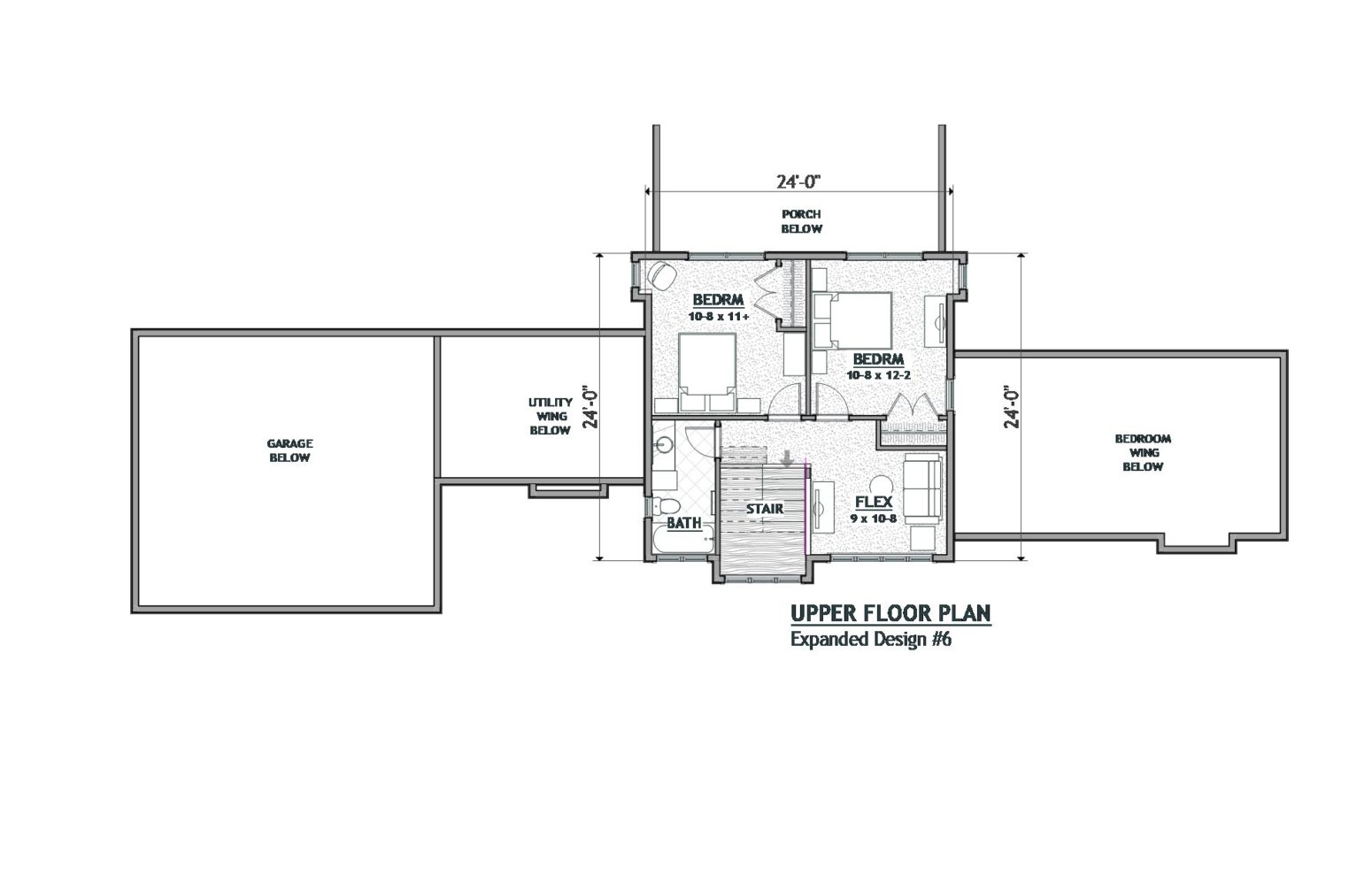
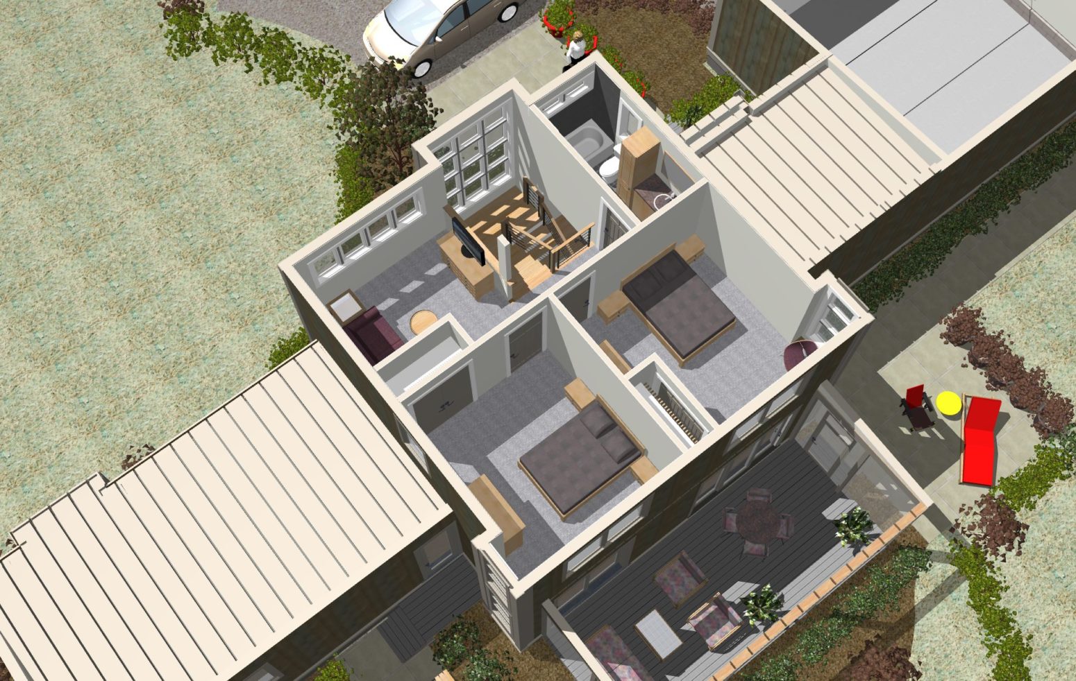
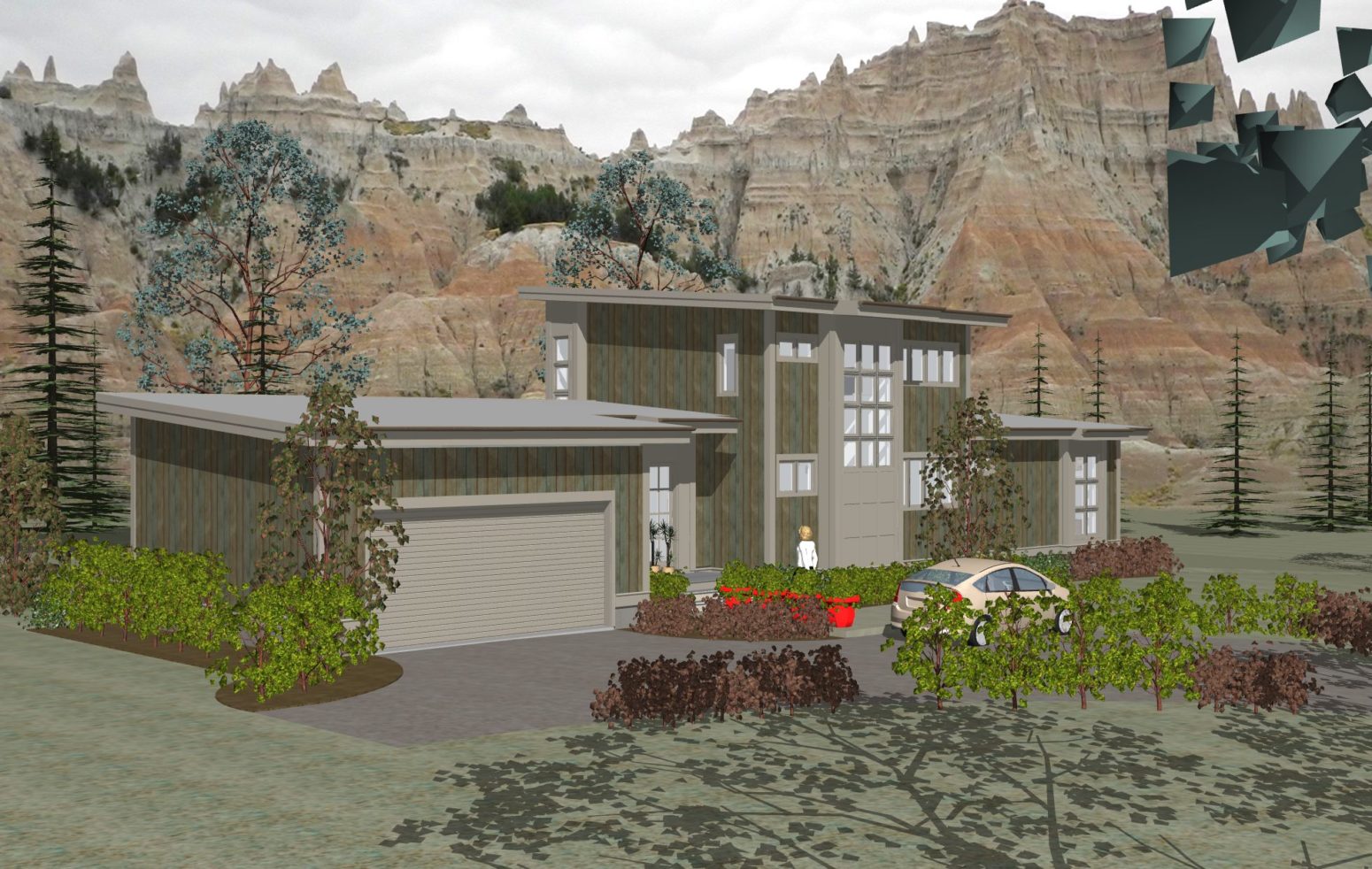
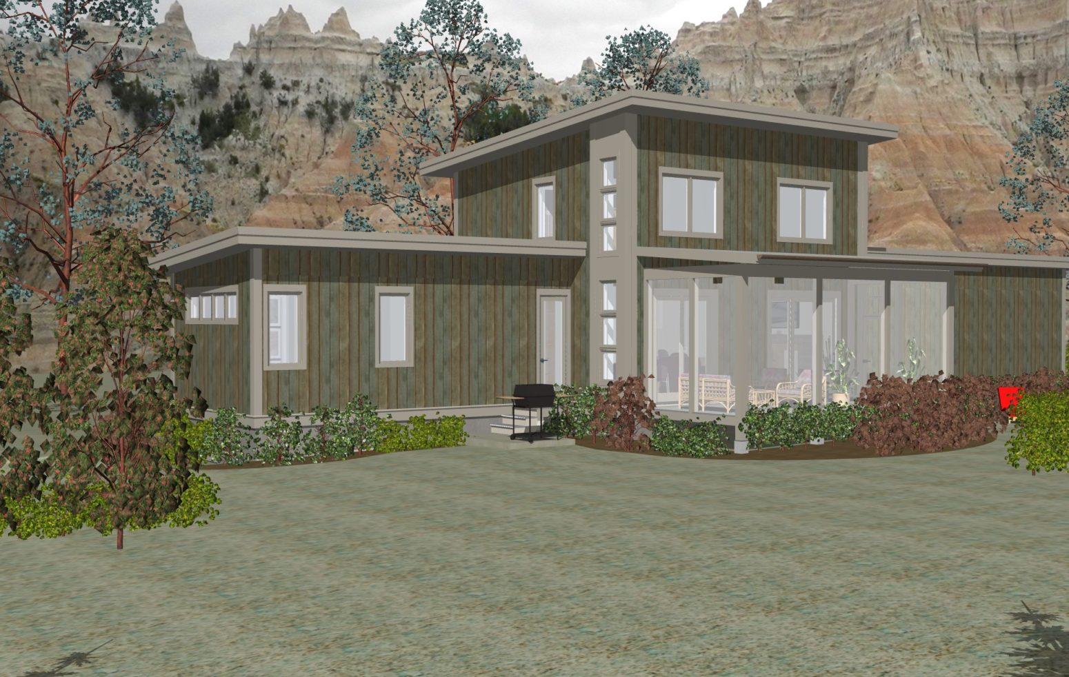
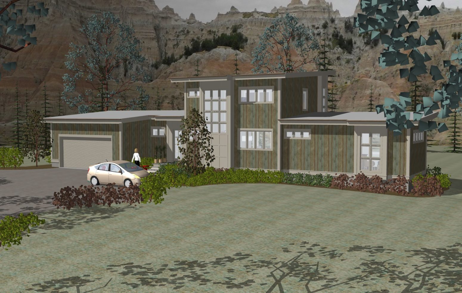
This design: The utility wing this main level projects to the left and incorporates the single entry. This frees up the core design which in this design permits a small flex/home office alcove. This plan also has a semi private comfortable kitchen space with a great window looking to the front. A window theme exists at the front stair and the 2 rear side corners which create exterior character and bring in effective light. The master enjoys comfortable space, effective windows on 3 sides, and a nice closet and bath set up.
Style: As drawn this design has an easy contemporary look. A crisper siding material and color would change the look for sure.
